A Seat at TABLE
A semester-long human-centered design engagement with TABLE, an Orange County nonprofit that feeds food-insecure kids. We were asked to grow family volunteering — and found that the real constraint wasn't willingness at all.
 Case study conducted in partnership with TABLE, a 501(c)(3) nonprofit in Orange County, NC
- ROLE
- UX researcher & design team member (team of 5)
- DURATION
- One semester, full HCD cycle
- METHODS
- Listening sessions, card sorting, empathy mapping, brainstorming, mash-ups, 2×2 prioritization, storyboarding
- PARTICIPANTS
- 17 across 4 sessions — parents, grandparents, a 4-year-old, and TABLE staff
- OUTCOME
- Three validated concepts presented to TABLE leadership with an assumption-testing plan
"How might we create more opportunities for parents to volunteer alongside their children to advance TABLE's mission while fostering a culture of volunteerism and social justice?"
After discovery, we reframed it: How might we expand and reimagine parent-child volunteering at TABLE in ways that are flexible, engaging, and build community — given real constraints with scheduling and communication? The shift matters. The original brief assumed we needed to motivate people. Research showed motivation was never the bottleneck.
Listening before assuming
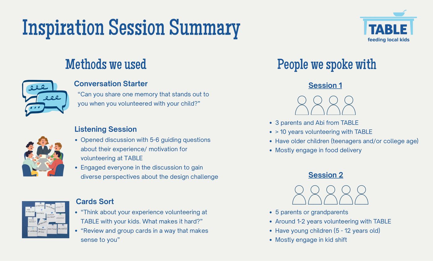
We ran two listening sessions with deliberately different participant profiles, because "parents who volunteer" is not one user group. Session one drew long-tenured families with teenagers who mostly do food delivery. Session two drew newer families with young children who mostly do kid shifts. Those two groups turned out to have almost inverse pain points.
- Conversation starter — "Share one memory that stands out from volunteering with your child" — to surface emotional texture before logistics.
- Guided listening session with 5–6 open questions, deliberately engaging quieter participants so the loudest voice didn't set the agenda.
- Card sort — "What makes it hard?" then group the cards however makes sense to you. Letting participants define the categories rather than validating ours.
Empathy mapping across extremes and mainstream
We mapped everything onto a Think & Feel / See / Hear / Say & Do / Pain / Gain grid, colour-coding by whether a data point came from an extreme user or the mainstream. Extremes are where the design opportunities hide — the person who's been volunteering for ten years and the person who just started see completely different systems.
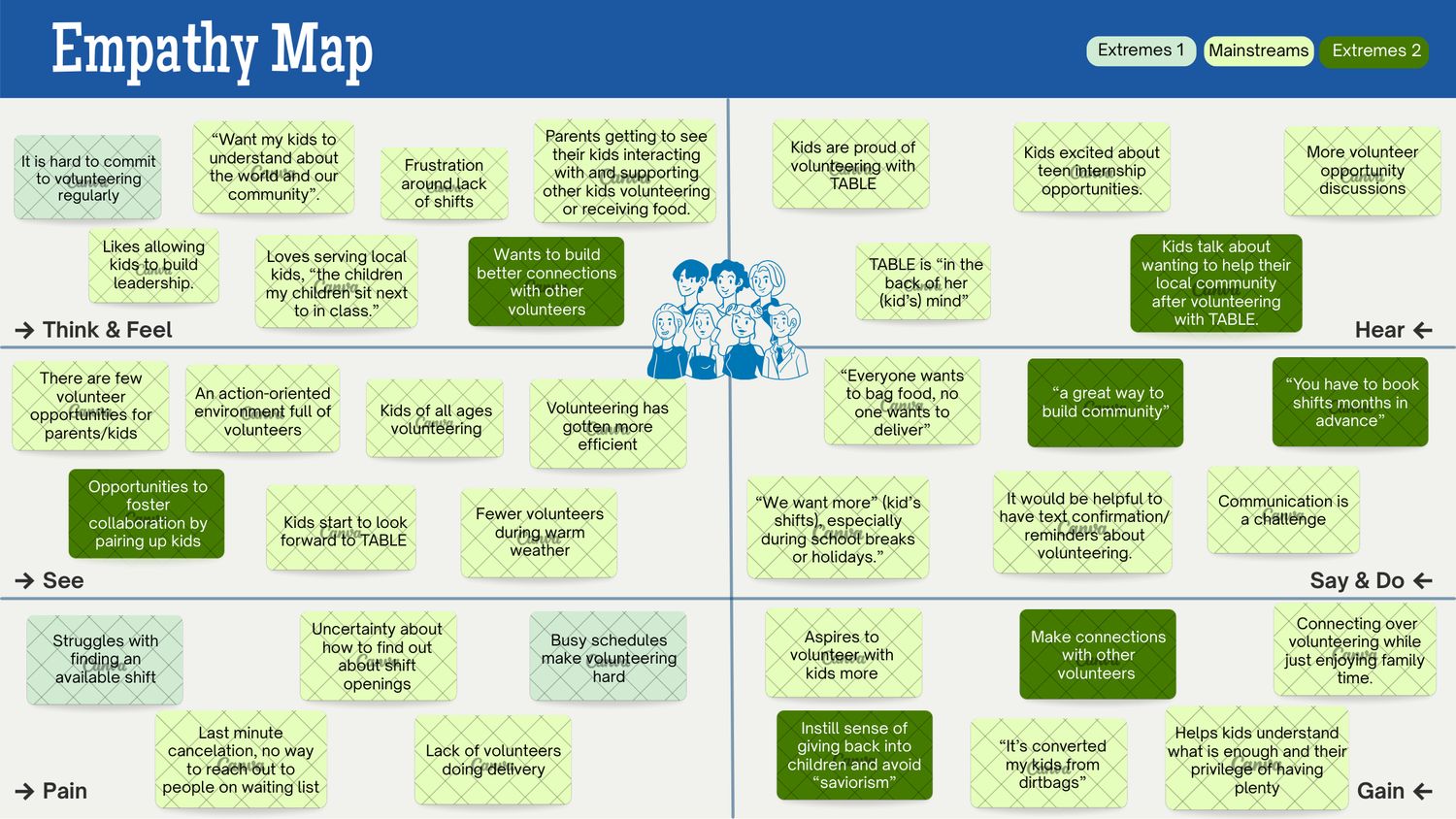
That asymmetry was the finding. Parents weren't unmotivated; they were structurally blocked. Every stated desire ("teach my kids about privilege," "connect with other volunteers," "see local impact") collided with the same wall: shifts book months out, communication is one-way, and there's no way to reach the waitlist when someone cancels last-minute.
From data to tension to insight
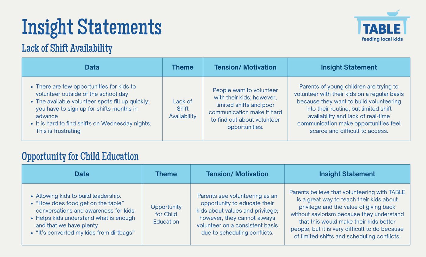
We built each insight through a four-column chain — data → theme → tension/motivation → insight statement — so that every claim traced back to something a participant actually said. This is the part I carry over directly from qualitative research: an insight isn't a good line, it's a defensible one.
// LACK OF SHIFT AVAILABILITY
Parents of young children want to build volunteering into their routine, but limited shift availability and no real-time communication make opportunities feel scarce and hard to access.
// OPPORTUNITY FOR CHILD EDUCATION
Parents see TABLE as a way to teach kids about privilege and giving back without saviorism — but scheduling conflicts make consistency nearly impossible.
// DESIRE FOR LOCAL IMPACT
Families are motivated by seeing impact in their own community — "the children my children sit next to in class" — but limited participation cuts them off from feeling it.
// FOSTER COMMUNITY BUILDING
Parents want to connect with other volunteers, but weekly turnover in who shows up means those relationships never compound.
Generating wide, then cutting hard
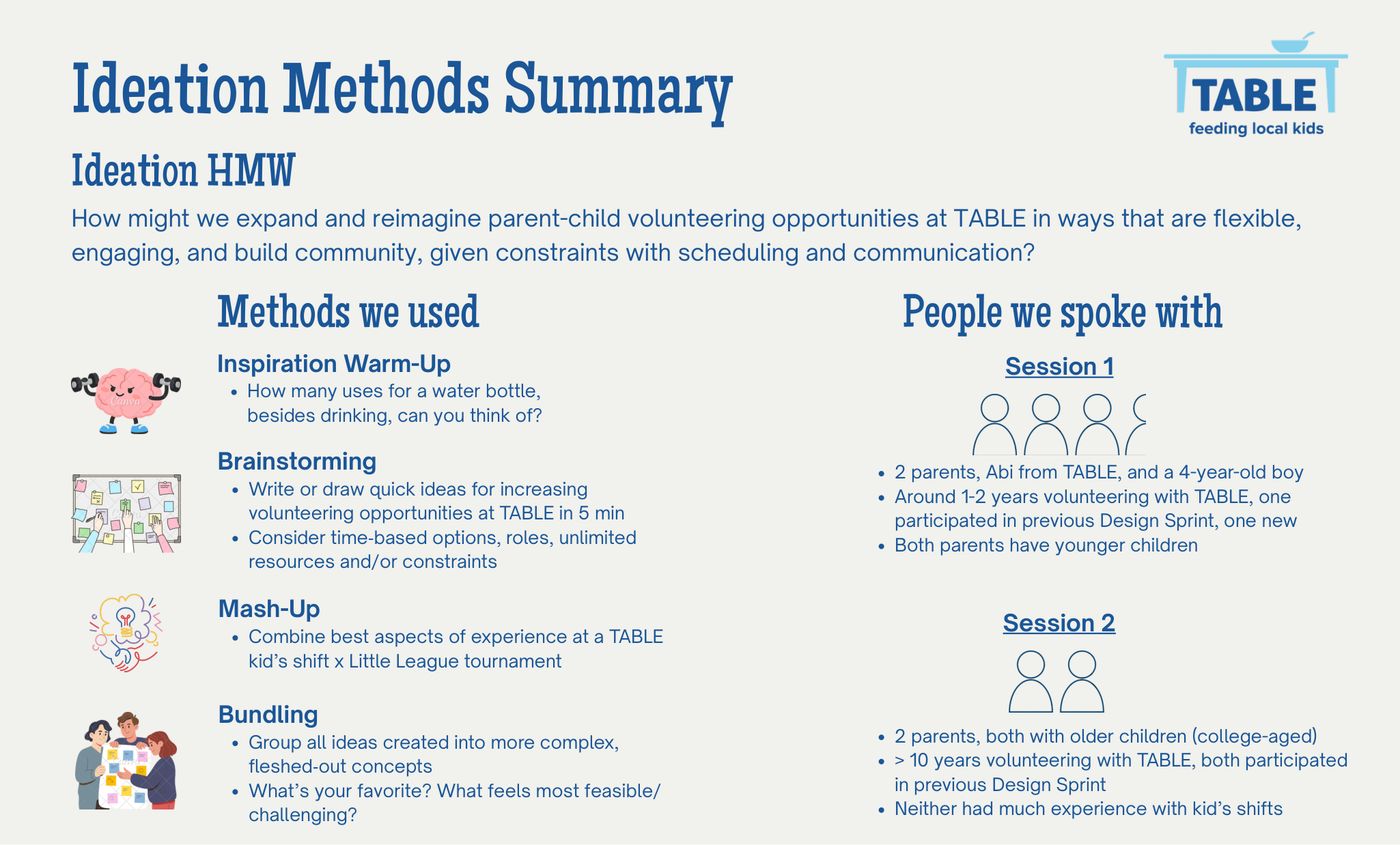
We brought participants back for co-ideation rather than ideating at them. Warm-up divergent thinking first ("how many uses for a water bottle?"), then rapid sketching, then a mash-up exercise — TABLE kid's shift × Little League tournament — to force unfamiliar combinations. Bundling turned scattered ideas into coherent concepts.
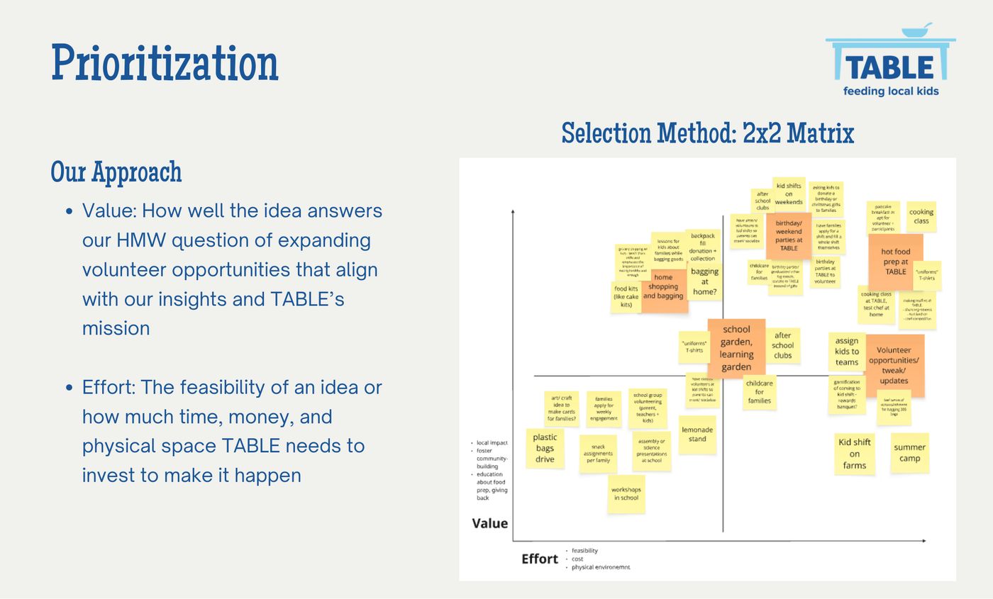
Prioritizing on TABLE's effort rather than ours was a deliberate constraint. A concept that requires a nonprofit to hire staff is not a concept, it's a wish.
Three concepts, one recommendation
Home Shopping & Bagging
Families get a shopping list, assemble food or birthday kits at home on their own schedule, and donate them to TABLE. No fixed shift required.
Hot Food Prep at TABLE
Volunteer families cook nutritious meals on-site with food safety guidance, adding nutrition education for both volunteers and recipients.
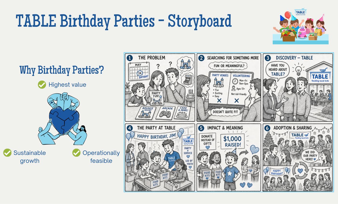
TABLE Birthday Parties ★
Birthday parties hosted at TABLE where guests pack food kits, families redirect gifts as donations, and teen volunteers run activities as staff.
Each concept was written as a full value proposition across both user groups — for host families and for teen volunteers, separately — and stress-tested against ten desirability, feasibility, and viability assumptions. We then had participants dot-vote their top three riskiest assumptions, which is what a pilot should actually test first.
// WHAT I'D DO DIFFERENTLY
We never spoke to the people we were designing around — TABLE's recipient families. Two of three concepts touch them directly (hot meal prep, kit contents), and we built those on assumptions rather than evidence. In a longer engagement that's the first gap I'd close.
I'd also push harder on testing before recommending. We ended with a prioritized assumption list, which is honest, but a single low-cost prototype party would have converted our top-voted assumption from a guess into a finding.